Have Questions? Get In Touch
Movado
Timeless Precision: Moving the Iconic Movado Brand into the Future
Movado Group, Inc. is one of the world’s most iconic luxury brands, its sleek watches an example of superb Swiss craftsmanship since the company’s founding in 1881. But in the 21st century, the logo felt dated, the digital experience was unsatisfactory and few consumers were aware of the brand’s innovative history, which includes pioneering timepieces and collaborations with artists such as Andy Warhol. Movado, whose name means ‘always in motion,’ approached Aruliden, a Material company, to explore ways to highlight its rich design heritage while emphasizing forward-looking and universal elements of the brand.
-
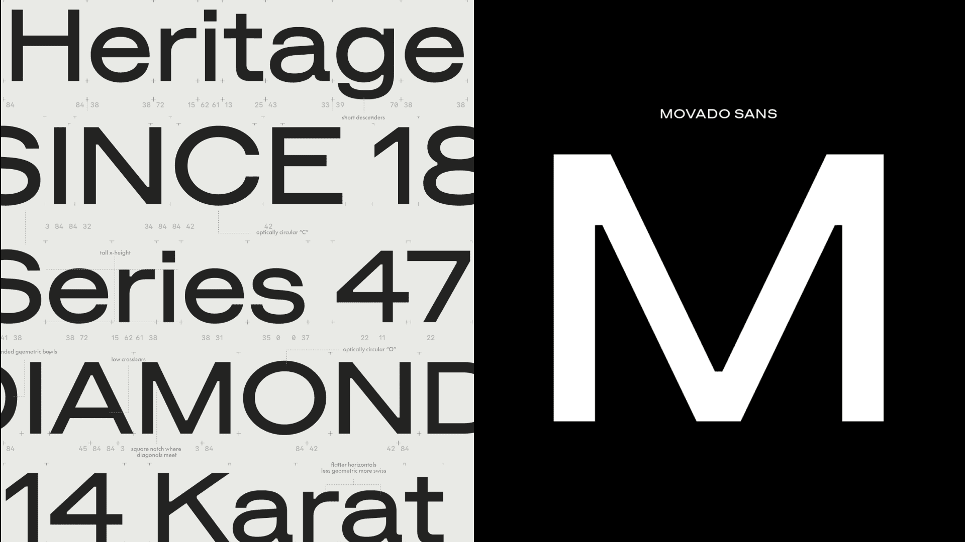
Partnered with the Berlin-based type foundry Schick Toikka to create Movado Sans – a bespoke type face based on Movado’s heritage typography – to complement the brand’s new wordmark
-
Created new taglines and custom copy for campaigns
-
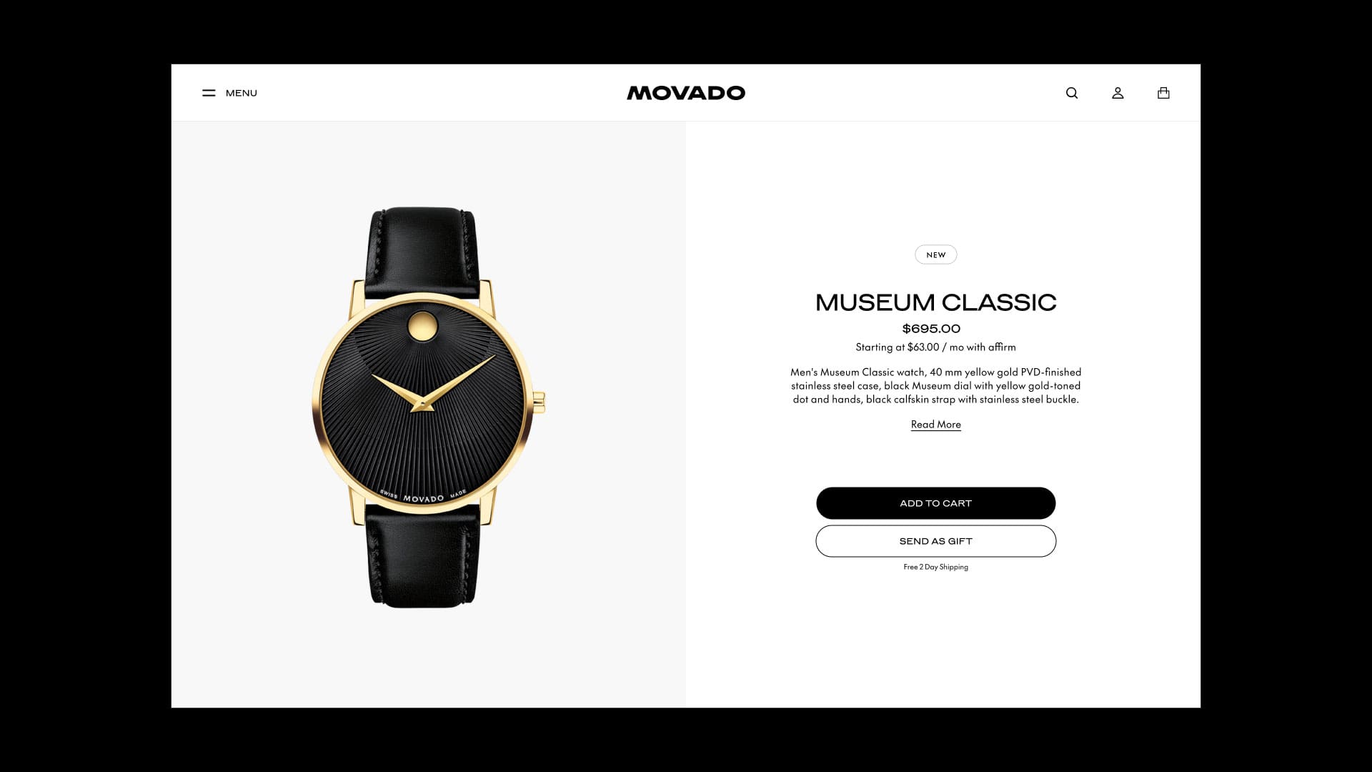
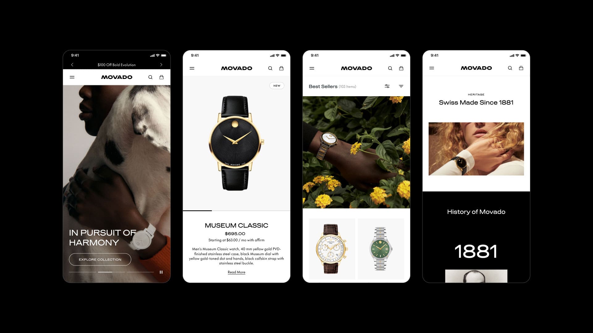
Developed and implemented a scalable Design Language System to strengthen visual identity across Movado’s e-commerce platform
-
Created color palettes, photography and typography influenced by the Bauhaus Movement
-
Launched a video campaign and print ads in major media
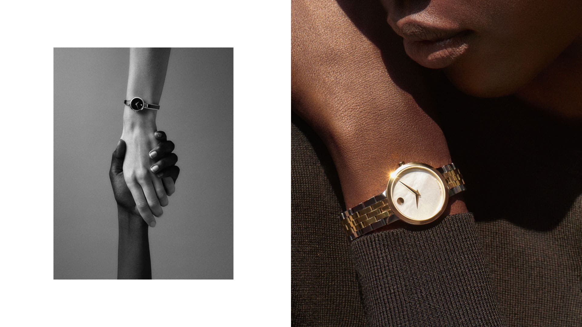
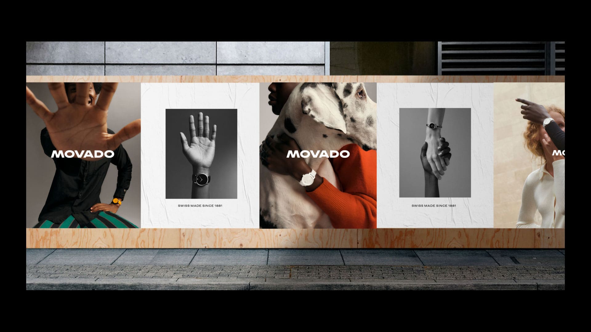
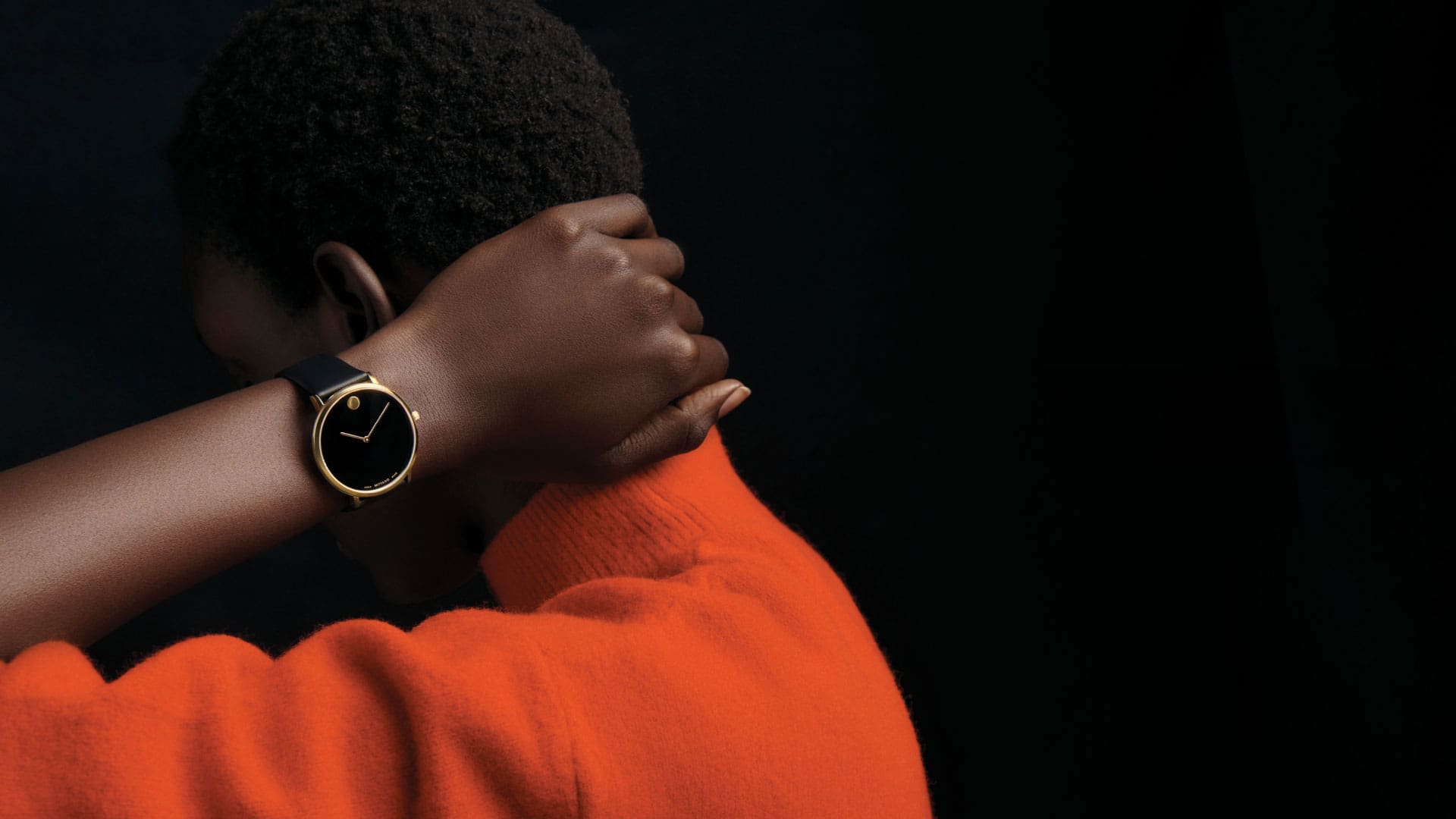
Movado watches are instantly recognizable by their dials, which feature a single dot at 12 o’clock that symbolizes the sun at high noon. The brand’s campaign, which launched in late 2023, was shot outside in natural daylight to convey emotional warmth and a sense of adventure. It features a diverse array of watch-wearing hands to position Movado as a universal timekeeper that appeals to people from different cultural backgrounds.
The campaign also included a full-page ad in The New York Times, a Women’s Wear Daily takeover on the front and back covers plus an inside spread, as well as ads in Vogue, GQ, Vanity Fair, The New Yorker, Esquire, Men’s Health, Elle, and Harper’s Bazaar. We’re proud that our work is helping Movado connect the dots between past and present, highlighting both its fascinating heritage and 21st century momentum.